From Noticeboard to Information Wall: How to Arrange Public Notices
Arrange public notices so visitors can scan by topic, recognise what is current and find the next action without reading every sheet.
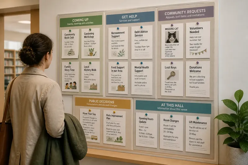
A visitor stands in a library entrance with a coat over one arm, looking from a missing-cat flyer to a council consultation and a handwritten class notice. The public notices are all visible, but nothing suggests where to look first. An information wall solves that problem through arrangement: it turns separate sheets into a collection people can scan, compare and use.
The shift from noticeboard to information wall is not mainly about adding more space. It is about giving notices a legible order, while keeping the rules of display fair and the information current. These decisions help a wall serve people who have only a moment, as well as those who need to read closely.
1. What changes when a noticeboard becomes an information wall?
A traditional noticeboard often grows one posting at a time. Someone finds an empty patch, pins up a sheet and leaves it beside whatever was already there. The result may preserve a history of community activity, but it asks each visitor to make sense of the whole surface unaided.
An information wall starts from the visitor’s questions. What is happening here? Which notices concern me? Is this still current? What should I do next? Grouping and visual order provide answers before anyone reads every line.
This does not require a new fixture. A wall with a few carefully defined areas can work better than a large board filled edge to edge. The change is from accumulation to curation: each notice has a reason to occupy its place, and each group has a clear purpose.
2. How should notices be grouped?
Group notices by the kind of decision a reader needs to make, not by the organisation that supplied the paper. A visitor looking for a local class may not know which association runs it; they do know they want activities and events.
Useful groups might include:
- Coming up: events, meetings and activities with a date or booking action.
- Services and support: help available locally, with clear contact details.
- Community requests: appeals, lost-property notices and invitations to contribute.
- Public decisions: consultations, planned changes and ways to comment.
- From this venue: opening changes, room arrangements and facility notices.
Keep the labels short and familiar. “Things to do” may be easier to understand than an internal department name. If one group becomes crowded, split it only when visitors can readily tell the difference between the new sections. Too many tiny categories turn scanning into another task.
3. Where should each group sit?
Place the most broadly useful information where someone naturally pauses, such as near the entrance to a library foyer or beside the public counter, without blocking movement or access. Put related groups together and give each a visible boundary: a heading, a strip of colour, a frame or a modest gap.
Arrange information in a consistent direction. For example, a reader might scan from left to right across sections, then down within each one. Keep headings above their notices rather than allowing a neighbouring group’s label to appear to cover the wrong papers. A clear margin around a section helps it read as a unit.
Consider the viewer’s position. If people approach from both sides, a layout that only makes sense from one angle can leave half the wall confusing. Keep essential text at a comfortable reading position for the people who use the venue, and avoid placing important details behind a door, plant or queue.
Say you manage a community hall and have a wall beside its entrance. You group current events under “Coming up”, local support under “Get help”, and venue changes under “At this hall”. A visitor arriving for a meeting can check the venue section quickly, while someone with time can browse the event notices without mistaking them for official building information.
4. What makes a notice easy to scan?
People usually decide whether a notice is relevant before they read its small print. Make that first decision easier by giving each sheet a clear title and a visible clue about its purpose: an event name, service type or action such as “Book a place”. Put the date and the next action where they can be spotted quickly.
Use a simple, consistent display style. A printed heading card can identify a section; a plain backing can keep the papers distinct from the wall. Avoid decorative borders, competing colours and large logos that draw attention away from what the notice asks the reader to do.
Readability also depends on the material itself. Small, crowded text may be difficult to use at a distance, while glossy paper can catch glare. Where a notice contains essential details, ask its provider for a readable version rather than trying to rewrite information that must remain accurate.
Keep a modest amount of open space between papers. It gives the eye a place to stop and helps visitors see where one notice ends. Filling every gap may appear efficient, but it makes each sheet compete with the next.
5. How can the display stay current and fair?
A curated wall needs a clear way to decide what belongs on it and when a notice should come down. Set a visible submission route, such as a named desk or venue email, and explain any limits on subject, format or display space. Apply the same criteria to comparable requests, rather than letting familiarity determine whose paper gets the best position.
Give notices a review date or an expiry date where appropriate. A staff member or volunteer can check the wall as part of an existing opening or closing routine, removing expired events and asking whether ongoing information still applies. Keep a small record of who is responsible for the review, so the task does not disappear when someone is away.
There is no need to create an elaborate approval process for every sheet. It is usually not worth the effort to rank ordinary community notices by tiny differences in design or to write a separate rule for every possible subject. A short, public set of criteria and a regular review are easier to explain and apply.
For information that carries official authority, such as a venue closure or a public consultation, make its source clear. Do not let an unofficial flyer appear to speak for the organisation simply because it is mounted beside an official notice.
6. How can you tell whether the layout works?
Observe the wall during ordinary use without asking visitors to complete a formal task. Do people pause at the same section and still seem unsure? Do they reach for a notice only to discover that its date has passed? Are several sheets repeatedly covered by newer ones? These are useful signs that the arrangement or upkeep needs attention.
Invite a colleague who did not arrange the display to find a particular kind of information. Ask them to show where they would look for a local activity, a support service or a change to the venue. If they have to read every notice to work it out, revise the group labels or section boundaries.
Change one part at a time where possible. If you move sections, keep the headings stable so regular visitors can learn the new arrangement. A small note saying “Events moved to the left panel” may help during the transition, but remove it once the change is familiar.
What do people ask about information walls?
How many categories should a public notice wall have?
Use only as many as visitors can understand at a glance. Start with broad, plain-language groups, then divide a section only when its notices serve clearly different needs.
Should notices be arranged by date or by topic?
Topic is usually the better first arrangement because it helps people find relevant information without knowing its date. Within an events section, placing the soonest upcoming activity first can help visitors choose what to read.
Can community members post notices themselves?
That depends on the venue’s policy and available staff time. A supervised submission route helps keep information current and gives everyone the same explanation of what the wall can accommodate.
What belongs on an information wall instead of a website?
Use the wall for information that visitors may need while they are physically at the venue, especially local notices and immediate changes. It can point to a website for fuller details, but essential information should not depend on a visitor having a phone or internet access.
A good information wall feels less like a pile of paper and more like a useful public surface: its sections make sense, its notices can be read, and its current details are easy to distinguish. When you review a noticeboard, look at it from the entrance as well as up close; the first view tells you whether the arrangement is doing its job before anyone reads a word.