The Waiting Room Sign That Tries to Say Everything
A crowded waiting room sign can bury the next action. Separate instructions by moment so visitors can see what to do now and what can wait.
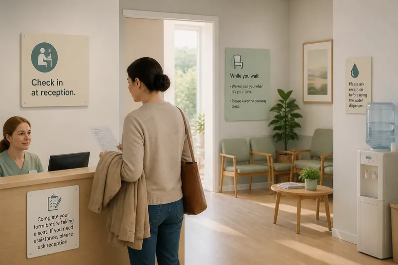
At a clinic reception, a visitor pauses with a form in one hand and a coat over the other arm. The waiting room sign tells them to check in, silence their phone, complete paperwork, keep the doorway clear, take a seat, report a change in symptoms and ask before using the water dispenser. They read it twice, then turn to the receptionist. A waiting room sign should help at the moment a visitor needs it, not make every instruction compete for attention.
The problem is not simply that the sign has too many words. Several instructions may be useful, but they apply at different times and in different places. Putting them together forces a visitor to sort them out while also managing an unfamiliar service. A better approach is to separate tasks by moment: what to do on arrival, what to do while waiting and what to do if circumstances change.
Why does one waiting room sign become crowded?
Signs often grow by addition. A new form brings a reminder; a recurring question brings another line; a changed procedure adds an instruction. Removing older wording can feel risky, particularly when staff want visitors to notice important requests. The result is a sign that tries to serve every purpose at once.
That creates competing demands. “Please check in at reception” is an immediate action. “Keep your belongings with you” applies throughout the visit. “Tell us if your contact details have changed” matters only to some visitors. “Please leave the room promptly when called” belongs to a later point. When these appear in one block, the visitor must work out which instruction applies now.
There is also a difference between information and direction. A visitor may need to know that a queue forms at reception, but also where to stand. A long paragraph can explain the arrangement without making the next action visible. Conversely, a short command can feel abrupt if it gives no useful context. The design task is to provide enough information for the decision at hand, in the place and moment where that decision occurs.
What happens in the invented clinic?
Imagine a small community clinic with a reception desk beside the entrance and a waiting area beyond it. The manager notices that visitors regularly approach the desk holding unfinished forms, ask whether they should sit down first, and miss a reminder about keeping the doorway clear. No single line is especially complicated; the instructions are just gathered on one sheet beside the entrance.
The manager and reception team begin by writing each instruction on a separate card. They sort the cards by the visitor’s likely moment of need, rather than by topic or staff department. One group concerns arrival, another concerns the wait, and a final group covers changes or requests. They also mark which instructions are already delivered face to face, so the sign does not repeat a spoken explanation without adding value.
At the entrance, they put only the immediate action: check in at reception. A small sign at the desk says to complete the form before taking a seat, with a note to ask reception if assistance is needed. In the waiting area, a separate notice explains how visitors will be called and asks them to keep the doorway clear. A discreet prompt near the water dispenser gives the relevant direction there, instead of adding it to the entrance sign.
The change is modest. The clinic has not removed every instruction, and it has not assumed that everyone follows the same route. But a visitor can now read the entrance sign and act without first sorting through reminders about the whole appointment. Staff can also point to the relevant notice rather than reciting a long list.
Say a visitor arrives with a completed form and is unsure whether to wait at the desk or sit down. The entrance message directs them to check in; the desk notice says what to do with the form and when to take a seat. The expected observable result is a clear next action at each point, not a promise that nobody will need to ask a question.
How should instructions be separated by moment?
Walk the visitor’s route and note the decisions that occur along it. Do not begin by designing a complete sign. Start with the sequence of moments: entering, checking in, waiting, responding to a call and asking for help. A service may have fewer or different moments, but the useful unit is the decision a person must make, not the subject label on a staff notice.
- At arrival: Give the action needed to enter the service, such as where to check in. Leave waiting-room etiquette for the place where it applies.
- At the service point: Explain what to hand over, complete or ask about. If staff already give the instruction reliably, decide whether a sign adds anything.
- While waiting: Put relevant directions where people sit or stand. Keep the wording focused on the situation in that space.
- When plans change: Make it easy to ask for help or report a change without burying that option among routine reminders.
- At the point of use: Place a facility-specific direction beside the facility, rather than on a general entrance notice.
Use plain verbs and name the destination or person where possible: “Check in at reception” is easier to act on than “Visitors are requested to complete the arrival process”. Keep related details together, but do not combine unrelated commands merely because they fit on the same sheet.
Not every message needs a separate printed sign. A spoken welcome, a mark on a form or a small label at the relevant object may serve better. The aim is not to multiply notices; it is to put each instruction where it can answer a real question. A small number of well-placed messages is usually easier to maintain than a wall of reminders.
Which wording and placement choices help most?
Choose a heading that names the visitor’s immediate task, such as “Check in” or “While you wait”. Keep the first line actionable. Supporting detail can follow, but it should not obscure the main instruction. A visitor who needs more explanation should be able to find it without having to decode a paragraph first.
Placement carries meaning. A direction beside the reception desk is more likely to be understood as applying to check-in than a general notice across the room. Put messages at readable height and avoid locations where a queue, open door or display of leaflets will hide them. If several signs share a small area, give them enough separation that one instruction does not appear to continue into another.
Use visual hierarchy with restraint. A clear heading, readable type and a little open space can distinguish one task from the next. Colour may help people locate a message, but it should not be the only way to distinguish instructions. Avoid decorative icons if they could be mistaken for a logo or are less clear than a short word.
What is not worth the effort? Rewriting every instruction in several near-identical ways, or adding symbols merely to make a crowded sign look designed. If the instruction still belongs to the wrong moment, nicer typography will not solve the underlying problem.
How can the clinic tell whether the new arrangement works?
Observe the route during ordinary service, without treating visitors as a test. Notice where people pause, what they ask at reception and whether a sign is hidden by the queue. Staff can keep a simple note of recurring questions and the point in the visit where they arise. A question that persists may point to unclear wording, poor placement or a missing spoken explanation; it does not automatically mean another sign is needed.
Ask staff who greet visitors whether the new messages match the way the service actually runs. If one team member says “take a seat” while the sign says to complete a form first, the contradiction needs resolving before the wording is polished. Visitors should not have to choose between a sign and a staff member to work out the procedure.
Make changes one message at a time where practical. If the entrance remains confusing, adjust that instruction or its position rather than adding a fresh block of text to the waiting-room notice. Check the sign again after a procedure changes, and remove wording that no longer applies. The point is to keep the information aligned with the service, not to preserve every sentence ever added.
What do people often ask about waiting room signs?
Should every instruction have its own sign?
No. Separate instructions by moment and location, but combine closely related details when visitors need them to make one decision. If a message is already clear in conversation or on a form, a second notice may add clutter rather than help.
How many instructions should go on the entrance sign?
Keep it to the actions a visitor needs before moving further into the service. If someone must read through directions for the waiting area, facilities and departure to understand where to check in, move those later instructions to their relevant points.
What if visitors still ask staff what to do?
That can be a useful signal, not a failure. Check whether the wording names a clear action, whether the sign is visible at the decision point and whether staff give consistent directions.
Should a clinic use icons as well as words?
Use an icon only when it supports a message people can already understand, and pair it with words if its meaning could be uncertain. Do not rely on colour or a symbol alone to communicate an instruction.
A waiting room sign works best when it does not try to stand in for every conversation or every later decision. In the clinic, separating arrival, waiting and facility messages gave each instruction a place in the visitor’s route. When reviewing a waiting room sign, ask what the reader needs to do at that exact spot; if the answer belongs later, move the message rather than squeezing it in.