Why the Best Wayfinding Starts Before the Sign
Wayfinding starts before the sign: learn to use sightlines, landmarks and repeated cues to make a route clearer before people reach a decision point.

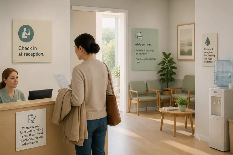
You step into a public building and can see a reception desk, a bright window and three corridors, but none tells you which way to go. Wayfinding starts before the sign: people need useful clues while they are still approaching a choice, not only a label when they arrive at it.
A sign can name a destination, but it cannot always repair a route that feels uncertain from the outset. Look at the whole sequence: what a person sees on arrival, what confirms the direction, and what reassures them after a turn. That sequence is the wayfinding system.
What does wayfinding before the sign mean?
It means giving people visual information early enough to form a simple expectation about where to go. A person approaching a junction should be able to recognise the relevant corridor, doorway or landmark before standing at the decision point and searching for an instruction.
Useful early cues can include a visible destination, a distinctive doorway, a continuous floor or wall treatment, or a clear view towards a shared reception point. None needs to carry the whole message. Together, they help a visitor build a mental picture of the route.
Think of the route as a sequence of questions a visitor asks without speaking: Where am I? Which way is the destination? Have I made the right choice? A good arrangement offers a cue for each question. A single sign at the last moment answers only the middle one, and sometimes too late.
Why can another sign fail to fix a confusing route?
Another sign may add words without resolving what makes the route hard to read. If several corridors look alike, a visitor may not know which corridor the sign describes. If a direction is visible only after a turn, the person may already have passed the point where it could help.
Signs can also compete with one another. A destination label, a temporary notice and an arrow may sit in the same field of view, each demanding attention. The visitor has to decide which message applies before deciding where to walk. More information is not automatically clearer information.
Before adding a sign, identify the actual uncertainty. Is the entrance hard to find? Is the destination hidden? Does a route split without a landmark? Does a person need confirmation after turning? The answer determines whether the missing element is a sign, a sightline, a stronger landmark or a change to how the approach is arranged.
What should a person see before reaching a junction?
They should see enough to prepare for the choice, but not so much that the view becomes crowded. If possible, make the next relevant space visible from the approach. A glimpse of a reception area, a recognisable doorway or a corridor with a distinct visual character can support orientation before a visitor has to stop.
Where the destination itself cannot be seen, offer a landmark that points towards it. A large, stable feature such as a coloured wall panel or an identifiable lift lobby is generally easier to remember than a small object that may move. Place the cue where it is visible from the direction people actually approach, not only from the position shown on a plan.
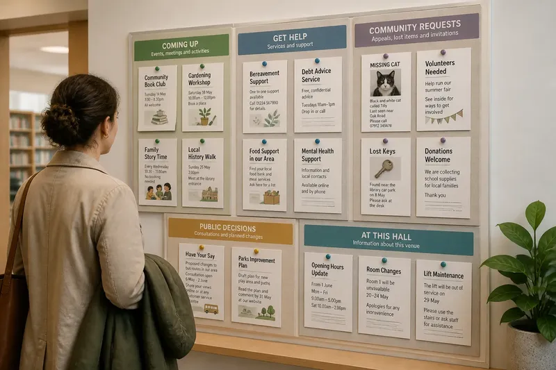
Check sightlines from different heights and routes. A noticeboard, open door or queue can obscure a cue for someone arriving from another entrance. A route that reads clearly when approached from one side may be ambiguous from the other.
How do you build a sequence of visual cues?
Begin with the visitor’s likely arrival point and trace the route to the destination. At each change in direction, note what is visible before the choice, what makes the intended path recognisable, and what confirms the turn afterwards. The sequence should feel connected rather than like a collection of unrelated labels.
- At arrival: make the main destination or the first useful information point easy to identify.
- Before a choice: show the relevant route, landmark or destination early enough to guide the approach.
- At the choice: use a concise sign or clear visual distinction where the alternatives are genuinely hard to tell apart.
- After a turn: provide a visible confirmation, such as the destination coming into view or a recognisable feature continuing along the route.
- At the destination: make the entrance or service point legible so visitors do not wonder whether they have arrived.
Imagine a visitor entering a library to find a community room beyond two similar corridors. The entrance view shows a colour panel near the correct corridor, but nothing indicates its meaning. A simple destination cue at the entrance, the same panel visible before the split and a clear room label after the turn would create a connected sequence. The expected observable result is that the visitor can recognise the intended corridor earlier and confirm arrival at the room.
Consistency matters more than decorative repetition. Use a visual feature in the same way along a route, and do not assign the same colour or symbol to unrelated destinations nearby. If a cue is only meaningful after someone has already learnt a local code, pair it with plain language where a visitor makes a decision.
How can you tell where the route becomes unclear?
Walk the route as a first-time visitor would, beginning outside the entrance or at the point where people actually arrive. Pause before each junction rather than standing directly beneath its sign. Ask what you can see, which destination appears to match it, and what would confirm that you have chosen correctly.
Try more than one approach if the building has several entrances. Look for distractions that change the view, including a queue, a propped-open door, temporary furniture or a notice placed at eye level. These details can alter what appears important, even when the permanent signs have not changed.
Where it is appropriate, invite someone unfamiliar with the route to describe what they think each visible cue means. Listen for hesitation and watch where they look before offering directions. This is not a formal test; it is a way to notice gaps between the message intended by the designer and the clues a newcomer can actually use.
Record the points of uncertainty in plain terms: “the two doors look alike” is more useful than “the signage is poor”. It points to a decision that can be addressed, such as distinguishing the doors or making the destination visible earlier.
Which wayfinding questions come up most often?
Should every corridor have its own colour?
Not necessarily. Colour can help distinguish routes when it is visible and used consistently, but too many colours can become difficult to remember. Pair any colour cue with a destination name, symbol or recognisable place where visitors need to choose.
Where should a directional sign go?
Place it where a person can read it before committing to a turn, and make its arrow clearly correspond to the route in view. A sign positioned only after the junction may confirm a choice, but it cannot guide someone who has not yet made it.
Can a landmark replace a sign?
A landmark can help people recognise a route, especially when it is distinctive, stable and visible from the approach. It is not a substitute for essential written information where visitors need a destination name, accessible route details or an explicit direction.
What should you change first when a route feels confusing?
Find the earliest point where a newcomer loses a clear sense of direction, then address the missing clue at that point. That may mean opening a sightline, distinguishing a doorway or moving information earlier rather than adding another sign at the destination.
What is not worth the effort?
It is rarely useful to add a new symbol, colour or decorative marker to every stretch of a route just to make it feel designed. Each extra cue asks people to interpret another piece of information. Keep what helps distinguish a real choice, and remove or simplify cues that repeat an instruction without clarifying it.
A small change to the view can matter more than a new sign. If a movable screen blocks a landmark, adjusting its position may restore a useful visual connection. If the route is genuinely hidden or the destination name is unfamiliar, a sign may still be needed; the point is to make it part of a legible sequence rather than expect it to do all the work.
How can you make the route easier to read?
Start at the approach and look for the first moment when a visitor needs to predict where to go. Make a relevant landmark, destination or route distinction visible before that moment. Add a concise sign at the choice if the visual cues alone do not separate the options, then make the next cue confirm the direction.
Wayfinding starts before the sign because people orient themselves through what they can see, recognise and connect along the way. When the route offers those clues in a clear order, signs can answer specific questions instead of trying to rescue an unclear layout. The useful final check is simple: from each approach, can a newcomer see what to do next before they have to guess?